Big New Update To Wandera Mobile App
So whats new? Aside from a slick new visual interface, there’s actually a lot more going on than meets the eye. The first thing you’ll notice is a striking use of colour, which follows a traffic light style system to intuitively guide the user’s behaviour based on the status of the device.
If you are greeted by the cool embrace of green when you open the Wandera app, then breathe easy. Green is used when the device is in a secure state, highlighting information most useful in that context – typically an overview of the threats the device has been protected from, plus a status update on data usage.
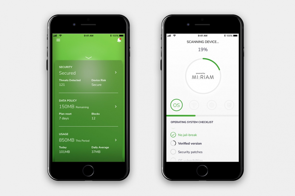
This philosophy is present across this renovation. The Wandera app is now context-aware, only showing the information most relevant to the user at that given moment. That makes using the app a far more intuitive and helpful experience, streamlining user interaction to the insights that matter.
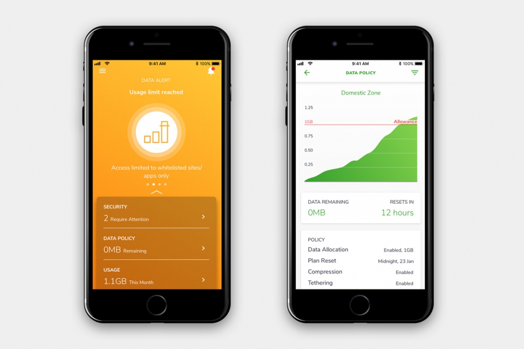
The amber state comes into play when there is an issue on the device. Once again this intelligently adapts to the context, for instance if a user has hit a data cap, or security settings are such that the device might be vulnerable to attacks. The user may or may not be able to address these themselves, but from an awareness perspective it’s a crucial tool for informing the user about the issues that matter.
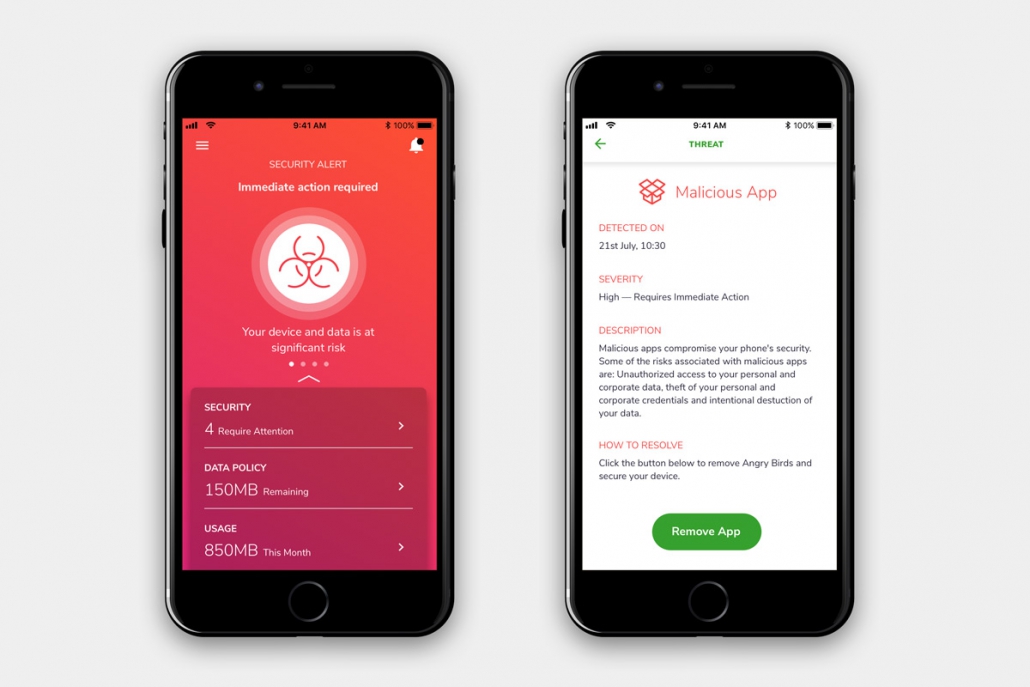
The final state, as you almost certainly managed to guess, is the more alarming hues of crimson red. If you’re seeing red, something serious has impacted the device. Typically, this will be when the device has been compromised by an attack, such as when the presence of malware has been detected.
Depending on the particular device or operating system, the app will also now directly invite users to uninstall the malicious software at the touch of a button, straight from the Wandera interface.
Other improvements
The overall theme of this renovation is with usability in mind. This means that as well as using a context-adaptive way of presenting information, data is shown in a more logical and consistent way for the user too.
For example, threats are now listed in order of severity and all forms of data discrepancy between different reports have been unified. Policy and usage have been similarly aligned, and the app is generally more content-rich than before.
In all, these updates represent a significant improvement in employee usability, bringing a consumer-grade experience to an enterprise-grade product. Alongside the other Wandera 2.0 upgrades, it’s now even easier for businesses to implement the necessary security measures that workplace mobility requires.


